Blazor Modal Service
Use Blazor Bootstrap modal service to show quick dialogs to your site for lightboxes, user notifications, or completely custom content.

See blazor modal service demo here.
Methods
| Name | Return Type |
|---|---|
| ShowAsync(ModalOption modalOption) | Task |
ModalOption Members
| Property Name | Type | Description | Required | Default |
|---|---|---|---|---|
| FooterButtonColor | ButtonColor | Gets or sets the footer button color. | ButtonColor.Secondary | |
| FooterButtonCSSClass | string | Gets or sets the footer button custom CSS class. | null | |
| FooterButtonText | string | Gets or sets the footer button text. | OK | |
| IsVerticallyCentered | bool | Gets or sets the IsVerticallyCentered. | false | |
| Message | string | Gets or sets the modal message. | ✔️ | null |
| ShowFooterButton | string | Shows or hides the footer button. | true | |
| Size | ModalSize | Gets or sets the modal size. | ModalSize.Regular | |
| Title | string | Gets or sets the modal title. | ✔️ | null |
| Type | ModalType | Gets or sets the modal type. | ModalType.Light |
Examples
How it works
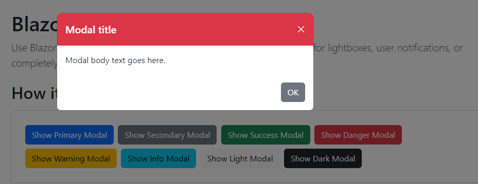
<Button Color="ButtonColor.Primary" @onclick="() => ShowModal(ModalType.Primary)">Show Primary Modal</Button>
<Button Color="ButtonColor.Secondary" @onclick="() => ShowModal(ModalType.Secondary)">Show Secondary Modal</Button>
<Button Color="ButtonColor.Success" @onclick="() => ShowModal(ModalType.Success)">Show Success Modal</Button>
<Button Color="ButtonColor.Danger" @onclick="() => ShowModal(ModalType.Danger)">Show Danger Modal</Button>
<Button Color="ButtonColor.Warning" @onclick="() => ShowModal(ModalType.Warning)">Show Warning Modal</Button>
<Button Color="ButtonColor.Info" @onclick="() => ShowModal(ModalType.Info)">Show Info Modal</Button>
<Button Color="ButtonColor.Light" @onclick="() => ShowModal(ModalType.Light)">Show Light Modal</Button>
<Button Color="ButtonColor.Dark" @onclick="() => ShowModal(ModalType.Dark)">Show Dark Modal</Button>
@code {
    [Inject] ModalService ModalService { get; set; } = default!;

    private async Task ShowModal(ModalType modalType)
    {
        var modalOption = new ModalOption
                          {
                              Title = "Modal title",
                              Message = "Modal body text goes here.",
                              Type = modalType,
                          };

        await ModalService.ShowAsync(modalOption);
    }
}
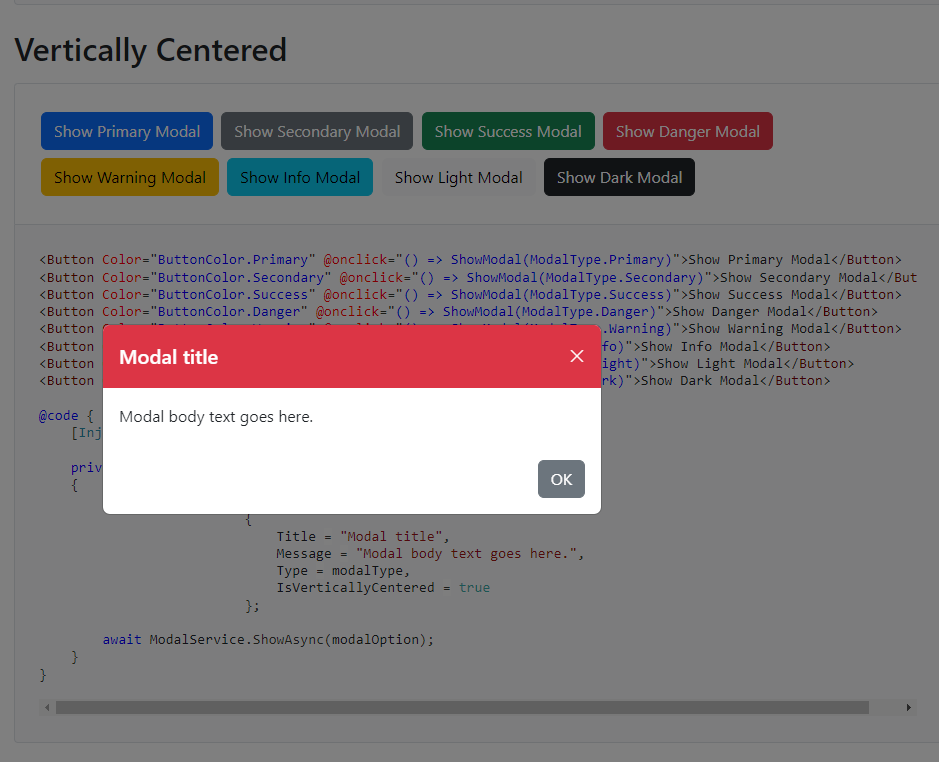
Vertically Centered
<Button Color="ButtonColor.Primary" @onclick="() => ShowModal(ModalType.Primary)">Show Primary Modal</Button>
<Button Color="ButtonColor.Secondary" @onclick="() => ShowModal(ModalType.Secondary)">Show Secondary Modal</Button>
<Button Color="ButtonColor.Success" @onclick="() => ShowModal(ModalType.Success)">Show Success Modal</Button>
<Button Color="ButtonColor.Danger" @onclick="() => ShowModal(ModalType.Danger)">Show Danger Modal</Button>
<Button Color="ButtonColor.Warning" @onclick="() => ShowModal(ModalType.Warning)">Show Warning Modal</Button>
<Button Color="ButtonColor.Info" @onclick="() => ShowModal(ModalType.Info)">Show Info Modal</Button>
<Button Color="ButtonColor.Light" @onclick="() => ShowModal(ModalType.Light)">Show Light Modal</Button>
<Button Color="ButtonColor.Dark" @onclick="() => ShowModal(ModalType.Dark)">Show Dark Modal</Button>
@code {
    [Inject] ModalService ModalService { get; set; } = default!;

    private async Task ShowModal(ModalType modalType)
    {
        var modalOption = new ModalOption
                          {
                              Title = "Modal title",
                              Message = "Modal body text goes here.",
                              Type = modalType,
                              IsVerticallyCentered = true
                          };

        await ModalService.ShowAsync(modalOption);
    }
}
Size

<Button Color="ButtonColor.Primary" @onclick="() => ShowModal(ModalSize.Regular)">Show Regular Modal</Button>
<Button Color="ButtonColor.Secondary" @onclick="() => ShowModal(ModalSize.Small)">Show Small Modal</Button>
<Button Color="ButtonColor.Success" @onclick="() => ShowModal(ModalSize.Large)">Show Large Modal</Button>
<Button Color="ButtonColor.Danger" @onclick="() => ShowModal(ModalSize.ExtraLarge)">Show ExtraLarge Modal</Button>
@code {
    [Inject] ModalService ModalService { get; set; } = default!;

    private async Task ShowModal(ModalSize modalSize)
    {
        var modalOption = new ModalOption
                          {
                              Title = "Modal title",
                              Message = "Modal body text goes here.",
                              Size = modalSize
                          };

        await ModalService.ShowAsync(modalOption);
    }
}
Change footer button color and text

<Button Color="ButtonColor.Primary" @onclick="ShowModal">Show Modal</Button>
@code {
    [Inject] ModalService ModalService { get; set; } = default!;

    private async Task ShowModal()
    {
        var modalOption = new ModalOption
                          {
                              Title = "Modal title",
                              Message = "Modal body text goes here.",
                              FooterButtonColor = ButtonColor.Primary,
                              FooterButtonText = "Got it!"
                          };

        await ModalService.ShowAsync(modalOption);
    }
}
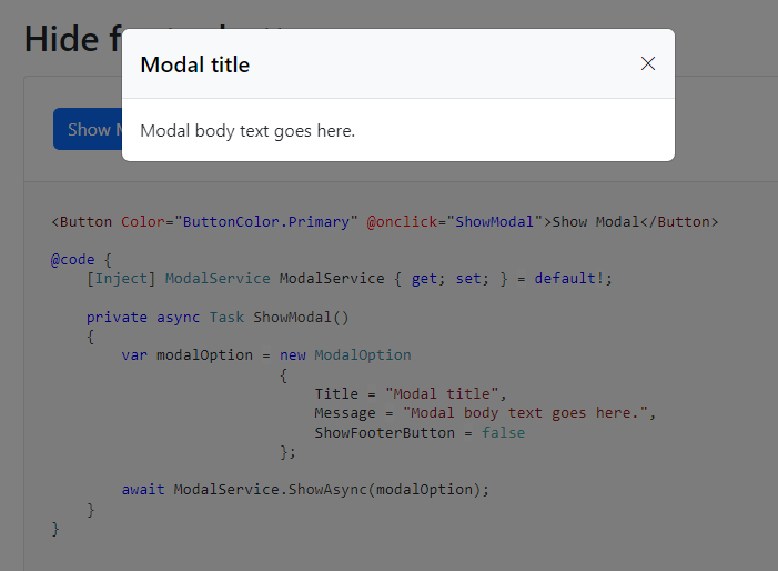
Hide footer button
<Button Color="ButtonColor.Primary" @onclick="ShowModal">Show Modal</Button>
@code {
    [Inject] ModalService ModalService { get; set; } = default!;

    private async Task ShowModal()
    {
        var modalOption = new ModalOption
                          {
                              Title = "Modal title",
                              Message = "Modal body text goes here.",
                              ShowFooterButton = false
                          };

        await ModalService.ShowAsync(modalOption);
    }
}
How to setup
- Add the Modal component in MainLayout.razor page as shown below.
@inherits LayoutComponentBase

...

... MainLayour.razor code goes here ...

...

<Modal IsServiceModal="true" />
- Inject ModalService, then call the
ShowAsync(...)method as shown below. ShowAsyncmethod accepts ModalOption object as a parameter.
@code {
    [Inject] ModalService ModalService { get; set; } = default!;

    private async Task SaveEmployeeAsync()
    {
        try
        {
            // call the service/api to save the employee details

            var modalOption = new ModalOption
                              {
                                  Title = "Save Employee",
                                  Message = "Employee details saved.",
                                  Type = ModalType.Success
                              };

            await ModalService.ShowAsync(modalOption);
        }
        catch(Exception ex)
        {
            // handle exception

            var modalOption = new ModalOption
                              {
                                  Title = "Save Employee",
                                  Message = $"Error: {ex.Message}.",
                                  Type = ModalType.Danger
                              };

            await ModalService.ShowAsync(modalOption);
        }
    }
}